Good communication depends on your ability to present information in a way that can be widely understood. Curating engaging slideshows is an important skill for presentations and teaching. This article intends to make it easier for you to create PowerPoints that engage viewers and makes information accessible.
Published on: 06/08/2024 · Last updated on: 25/06/2026
Templates and Layouts
Templates and layout are a key foundation for an accessible, well-organized slideshow. A template provides a unified color theme and font to all the slides, a layout creates a format for each individual slide. Layouts vary for the slide purpose, for example ‘title slide’ layouts and ‘heading and text slide’ will had different layouts.
Microsoft has several accessible templates that you can use this PowerPoint design templates gallery from Microsoft. Use the search bar and type ‘Accessible template’ to find a range of accessible templates, already designed for you. For more information about slide layouts, see Microsoft’s guidance on What is a slide layout? and find out how to Apply a slide layout.
Table of Contents
Include a table of contents at the start to outline topics and help students know what to expect. You can also add internal links to a particular slide to help navigation.
Provide an overview of session structure, including breaks and tasks. This supports focus, reduces anxiety, and helps students manage their time and prepare effectively.
Accessible highlighting
Colour and icons can give people another way for to process information and be really powerful for some learners. It’s important that colour appear alongside other cues (e.g. text) that would be read out to a screen reader user.
Icons can help label things while taking little space. You need to use icons that are accessible by just use simple icons that are clearly visible. Learn how to Insert and edit an icon in PowerPoint.
See Accessible Colour and Contrast for more
Text spacing and alignment
Proper text alignment and spacing improve readability and create a clear visual structure.
- Use left alignment for body text—it is the most readable and widely used format.
- Use line spacing of 1.5–2 to keep text clear without appearing cramped or too spread out.
- For presentations, ensure text is at least 18pt so it remains readable when displayed.
See how change text alignment, indentation, and spacing in PowerPoint Microsoft support provides helpful articles.
Tables
Use tables to communication structured information. This can be easier to process than blocks of text and bullet points.
Beware of information overload and help students understand what is relevant.
See Creating accessible tables for practical accessibility considerations.
Images/video for dual coding
- Use dual coding by adding relevant media/images to also support text or ideas. This can help processing and working memory, particularly for neurodivergent thinkers (ADHD, dyslexia).
- Be mindful that sometimes that poorly chosen images can also distract and cause further cognitive load.
Also see Writing alt-text.
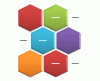
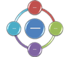
SmartArt
SmartArt helps present text information in a visually appealing and structured way. This can be useful for processes, timelines and lists with lots of substructure.
Learn more about SmartArt Graphics or how to Create a SmartArt graphic from scratch article.
Visual Hierarchy: Accessible Structure
Here are some tips to ensure visual hierarchy:
- Use short simple sentences
- Make use of headings, subheadings. When doing so ensure to use ‘styles’. The Accessible Structure: Headings and Styles Article explains this further.
- Unique title for each slide. For slides with similar content using ‘continued…’ on the additional slide will make the two slides unique.
- Using bulleted lists
- Use icons and photos to reinforce concepts
- Minimize distractions with simple backgrounds
- Make your text large and avoid clutter
And here’s what you should avoid:
- Walls of text
- Bright contrasting colours
- Complex or cluttered layout
- Distracting backgrounds
- Small fonts
Test your design skills!
Test your accessibility design skills through this designing scenario. You will make 4 design decision, each decision impacts the next, so choose wisely. See how accessible you can make your final slide! Whether you do or do not pick the best options; focus on the feedback! Use this article to sharpen your accessible design knowledge.
Key Principles Continued
This article is focused mainly on design principles but there are still other important things to consider while designing an accessible slideshow such as