
Published on: 22/07/2024 · Last updated on: 25/06/2026
Structure
Use an accessible template
Why? Using an accessible template (or copying content into one) can help prevent accessibility issues you may inadvertently encounter.
How? Microsoft has several accessible templates that you can use by following the instructions in the Microsoft Learning Pathway Using Templates.
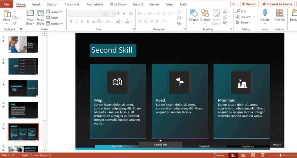
Example: The image shows the Microsoft Accessible Template: Classic Corporate Teach a Course Template. Please treat templates as a starting point and continue to apply accessibility best practices throughout.
Use a layout for each slide
Why? Use built-in slide Layouts to improve the structure of the content within your slides. Slide layouts do more than control the placement, they also set the reading order for people who use the magnified outline view or a screenreader.
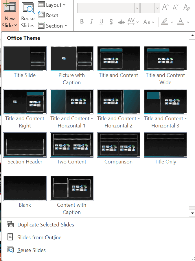
How? Add slides from the Home tab, and use the placeholders to add content. If you want to change the layout, select the slide and use the Layout menu. See Microsoft’s guidance on what is a slide layout? and find out how to apply a slide layout for more information.
Example: The image below shows layouts available, when adding a New Slide (screenshot taken from the Microsoft Accessible Template: Classic Corporate Teach a Course).
Give each slide a unique title
Why? Make sure the title box (Click to add title) is unique and added to a slides. Having a unique, descriptive title on each slide is important for screen readers to navigate through content. Titles provide context about the purpose of the slide. This allows students to understand the information that is being presented.
How? See guidance on how to Title a slide.
Example: If several slides have similar content, make each title unique. For example, use “Introduction (1)” and “Introduction (2)” or “(continued)”.
Structure content on the slide
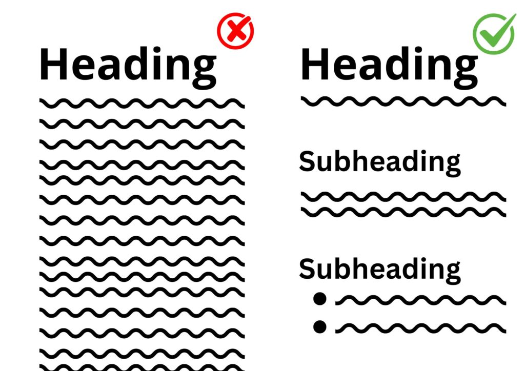
Why? To avoid slides being too overwhelming, use minimal amounts of text on the slides. If you are using lots of text on a slide, consider providing the text to students in a separate file. The key idea is to keep slides uncluttered and to optimise slide layouts using formats such as subheadings and bullet points.
How? Structure content with clear headings, bullet points and short text.
Example: The image shows structured content with heading, subheading and bullets, which is easier to read.
Use readable text
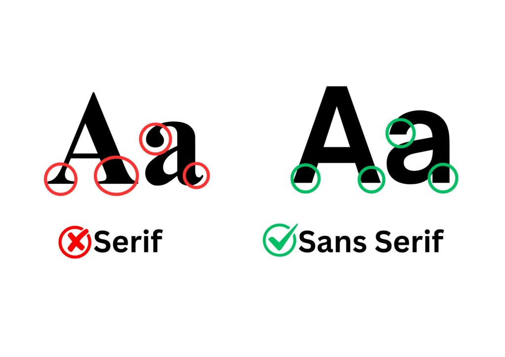
Why? Slides are presented in a variety of settings and the text needs to be readable by those at the back of the room. Text should be large to support viewing on a projector and print accessibility. Additionally, the font should be clear. Sans Serif fonts such as Arial and Calibri are more accessible than serif fonts such as Times New Roman. Serif fonts have ‘feet’ on the end of each letter which can make them less accessible to readers.
How? Use at least 18pt font size (preferably 20pt+), use sans-serif fonts (e.g. Arial, Calibri) and avoid dense blocks of text.
Example: The image shows the difference between serif and sand serif fonts.
Check and set the Reading Order
Why? Students may use a screen reader which reads aloud the academic content on their device. Placing the contents of each slide in a logical reading order is crucial for screen reader users to understand each slide.
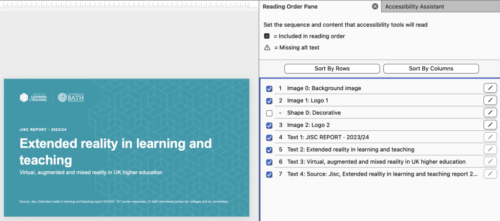
How? Make sure all additional text boxes and images have a logical reading order set. Follow the step-by-step instructions on setting and reviewing the Reading Order.
Example: The image below shows the slide content sorted by rows to ensure the reading order follows logically.
Colour and contrast
Check the colour contrast
Why? Slides that have a strong contrast between text and background help everyone view slides in different light conditions (e.g. bright rooms and with glare) and are more accessible for learners with low vision or colour blindness.
How? Keep colour contrast high between the text and background and manually check any items with WebAIM: Contrast Checker
Example: The images show the difference between poor and effective colour contrast.


Avoid using colour as the only way of conveying information
Why? Colour can be a powerful of highlighting information, but information shown with colour only will not be accessible for people with colour blindness.
How? Do not rely on colour alone to convey meaning and use additional cues such as text, labels, shapes, or icons. See Accessible Colour and Contrast for full details.
Example: Using red text to illustrate a negative consequence or green text to represent a positive consequence.
Use of media
Write alternative text
Why? In alt text, briefly describe the image, its intent, and what is important about the image for someone who can’t perceive it.
How? Add alt text to images, grouped images, SmartArt, shapes, charts, and embedded videos. Follow the Writing alt-text guidance for more details
Example: If you have create a diagram using shapes, group them together and provide a text description (alt-text) so that a screen reader can understand what the diagram shows.
Provide alternative formats for audio visual content
Why? This is important for people with hearing or vision difficulties, as they would not otherwise be able to access the content.
How? Provide captions for all video content, provide transcripts for audio content and consider audio description where visual detail is important. For further guidance on this Add closed captions or subtitles to media in PowerPoint – Microsoft Support
Example: If you have embedded a video conversation in your slide, use the Edit captions feature to add captions.
Plain English
Save the presentation with a descriptive file name
Why? Use a clear, descriptive file name so students can quickly identify the content. When accessing a document, the first thing encountered is the file name. A unique, descriptive file name helps individuals understand the general topic of a document.
How? To change this on PowerPoint click ‘File > Info > edit ‘Title’ under the ‘Properties’ menu.
Example: Presentations that represent lecture notes could be titled like this: Lecture 1 – Topic name – Initials. The students would be able to keep lecture notes in order, be able to see what the subject matter is at a glance, and be reminded who delivered the lecture.
Table structure
Set headers in tables
Why? Tables can be difficult to navigate for students who use assistive technologies. If tables cells are incorrectly formatted, it is difficult for screen readers to process the information. Screen readers use headers to navigate information, so it is important that any table you create has headers.
How? Use simple tables where possible (and See Creating accessible tables for further details):
- Include header rows
- Avoid merged cells
- Avoid fixed-width tables
- Consider alternative formats (e.g. text with headings)
Complete a final accessibility check
Why? The Microsoft Accessibility Checker may miss some issues and also sometimes report false positives. It is always important to follow best accessibility practices to minimise issues.
How? Use the built-in Accessibility Checker and make any additional checks before sharing your slides.
Share PowerPoint file to students in advance
Why? Where possible, share the original PowerPoint file as it retains accessibility features, rather than sharing as a PDF as the conversion may remove some important accessibility elements.
How? Make the slides available to students by uploading them to Moodle.