
Published on: 19/10/2023 · Last updated on: 25/06/2026
Introduction
Students engage with learning in many different formats, including documents, slides, webpages, audio, and video. Each format presents its own accessibility challenges, but the goal remains the same: to ensure content is usable by as many people as possible (see What is Digital Accessibility?).
The SCULPT principles provide a simple, practical framework to help you focus on the key aspects of digital accessibility across these varied contexts. Alongside this, accessibility checkers offer a quick way to identify and fix common issues before sharing your materials.
SCULPT Framework
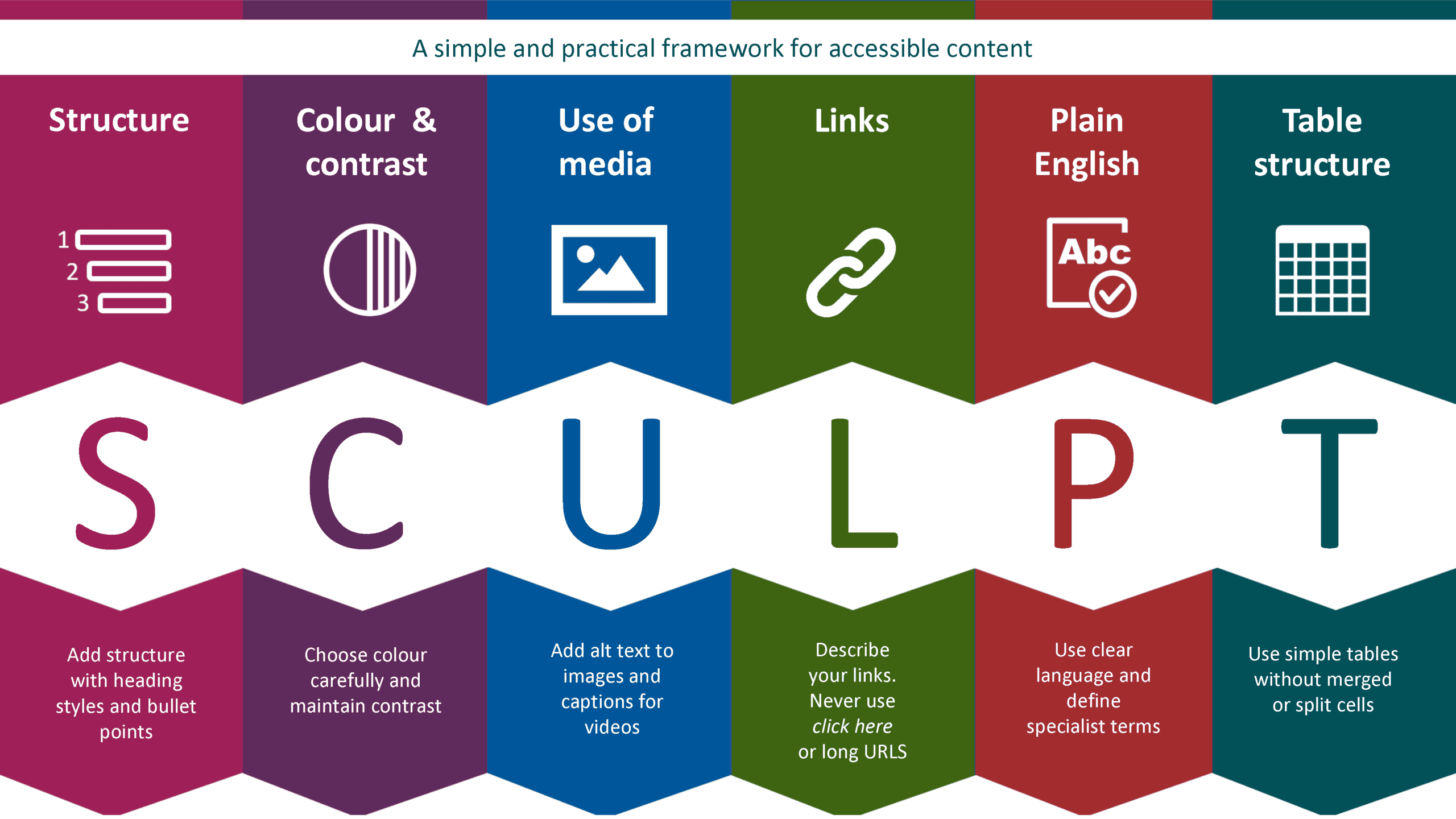
The letters of SCULPT represent these core digital accessibility principles:
- Structure: add structure with heading styles and bullet points
- Colour and contrast: content must be readable for users with low vision or colour blindness
- Use of media (images, video, audio): add alt-text to images and captions for videos
- Links: describe your links, never use Click here or long URLs
- Plain English: use clear language and define specialist terms
- Tables: use simple tables for data without merged or split cells
Structure your content
Well-structured content improves readability and supports screen readers.
- Always use heading styles to set title and subtitles. Never manually format heading text.
- In PowerPoint, use built‑in slide layouts. If you Insert other images or boxes, make sure to set the manually set the reading order.
- Use bullet-points and numbered lists makes content easy to read and use with assistive technology.
Learn more in the article Structuring Accessible Content
Colour and contrast
Content must be readable for users with low vision or colour blindness. Tired eyes work harder when colour contrast is poor, which can lead to eye-strain and headaches.
- Keep colour contrast high
- Avoid tricky colour combinations
- Use non-colour based indicators for meaning (labels, patterns)
- Know how to use tools to spot and fix the issues
Learn more in the article Making Colour and Contrast Accessible.
Use of media
Media should be perceivable by all users. This includes reducing barriers for people with visual, hearing, and cognitive impairments, and supporting wider access and understanding.
Images
Add alternative text (alt text) describing the images purpose
Audio
Include a transcript
Links are descriptive
Links should be meaningful and accessible which reduces ambiguity and works better with screenreaders
- Write descriptive link text that clearly explains the destination.
- Use links to support navigation to key resources/webpages/places in documents
- Avoid links that open in a new tab or window without warning, as this can be disorientating.
Learn how to Create Descriptive Links.
Plain English
Clear language benefits everyone to allow everyone to focus on the content.
- Use short, direct sentences.
- Explain specialist terms and expand acronyms on first use (for example, Web Content Accessibility Guidelines (WCAG)).
- Avoid unnecessary jargon and complex sentence structures.
- Avoid informal or ambiguous language.
Learn more about Writing in clear English.
Tables
Tables should be easy to interpret and formatted to support screen readers.
- Always set column and/or row headers
- Avoid merged or split cells, nested tables, and blank rows or columns
- Add a caption to describe what the table shows
- Use tables for data only, not for layout
Learn more about Creating accessible tables.
More on the SCULPT framework
This SCULPT framework has been adapted for the University of Bath based on the work at Worcestershire County Council. Access the SCULPT for accessibility Worcestershire County Council.
SCULPT by Helen Wilson is licensed under a Creative Commons Attribution-NonCommercial-ShareAlike 4.0 International Licence.