Good communication depends on your ability to present information in a way that can be widely understood.
Curating engaging slideshows is an important skill for presentations and teaching. This article intends to make it easier for you to create PowerPoints that engage viewers and makes information accessible.
This article walks you through 8 key design principles + some bonus key principles at the end. This guidance can help you to design slideshows that are accessible, aesthetic and all around awesome.
The Accessible PowerPoint Checklist provides additional guidance on how to create accessible slideshows.
Published on: 06/08/2024 · Last updated on: 14/08/2024
Test your design skills!
Test your accessibility design skills through this designing scenario. You will make 4 design decision, each decision impacts the next, so choose wisely. See how accessible you can make your final slide! Whether you do or do not pick the best options; focus on the feedback! Use this article to sharpen your accessible design knowledge.
Templates and Layouts
Templates and layout are a key foundation for an accessible, well-organized slideshow. A template provides a unified color theme and font to all the slides, a layout creates a format for each individual slide. Layouts vary for the slide purpose, for example ‘title slide’ layouts and ‘heading and text slide’ will had different layouts.
Microsoft has several accessible templates that you can use this PowerPoint design templates gallery from Microsoft. Use the search bar and type ‘Accessible template’ to find a range of accessible templates, already designed for you. For more information about slide layouts, see Microsoft’s guidance on What is a slide layout? and find out how to Apply a slide layout.
A disclaimer
Templates are only a starting point of accessible design. Some templates that claim to be accessible may have some accessibility issues. Make sure to use your own best practices and knowledge while using these tools.
Accessible Fonts
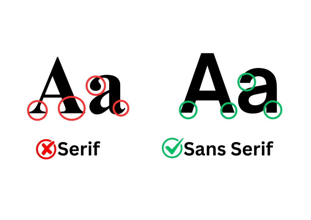
Sans Serif fonts such as Arial and Calibri are more accessible than serif fonts such as Times New Roman. Serif fonts are harder to read because they have small decorative strokes on letters. These details can make the text difficult for people with vision problems or dyslexia.
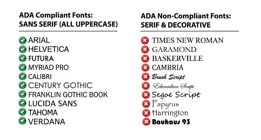
The ADA Sign Guidelines is a helpful resource to identify accessible and less accessible fonts. Below is an image that provides examples of accessible and inaccessible fonts.
Ensure font is large enough.
Presentation Slideshows are usually shown to a group of people. To ensure that all people who are witnessing the presentation can read the slides, it is advised that the font is no smaller than 20ppt.
Colour contrast and combinations
Accessible Colour and Contrast – Learning and Teaching (bath.ac.uk)
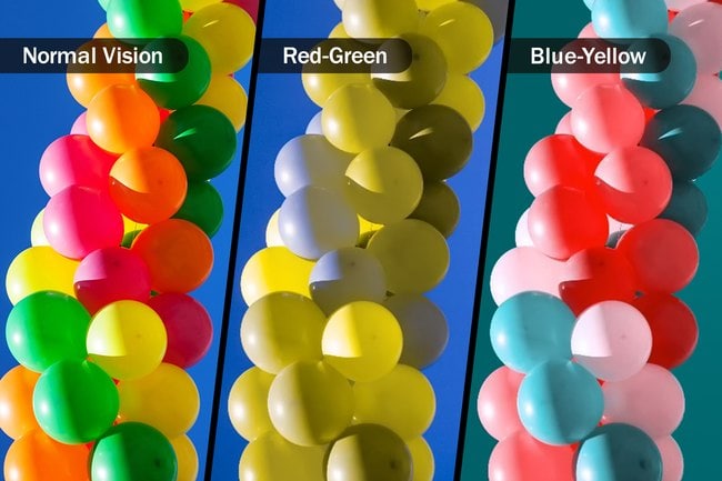
There are several types of colour blindness of colour vision deficiency. There are 4 types of red, green colour blindness, two types of blue yellow and a rare complete colour blindness called monochromacy colour blindness. To read more about the types of colour blindness the Colour Blind Awareness site provides examples and further explanation.
Colour vision deficiency or CVD is a more accurate term for the phenomenon of colour blindness, as people with this condition can see colour but it is distorted for them and it is difficult to distinguish between hues.
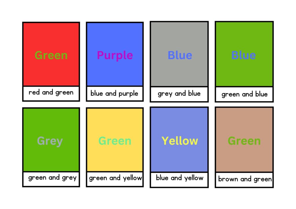
CVD comes in many types, so there is no single colour to use or to avoid, but there are some colour combinations that make it notoriously difficult for people with colour blindness to identify, particularly when those colours are placed in close proximity.
- Blue and Yellow
- Green and Grey
- Light Green and Yellow
- Red & green
- Blue & purple
- Blue & gray
- Green & brown
- Green & blue
Appropriate colour contrast is an important principle to consider while designing your slideshow.
The Vengage Accessible Color Palette Generator is a useful tool that allows you to create an accessible colour palette that you can use for your slideshow!
The colour contrast between the text and background is key. The WebAIM: Contrast Checker is a useful tool that allows you to check the contrast by using hex codes. The contrast is calculated based on the ratio of 8.59:1. There is a bookmark version of this tool that allows you to check the contrast across desktop apps and sites.
Note: WCAG defines accessibility compliance with several ratings (A, AA, and AAA). An A rating means your design meets basic accessibility standards, but aiming for an AA rating is recommended.
Indicating information with more than just colour
Not everyone sees colour the same way. Avoid using only colour to indicate information on your slides.
Don’t rely only on color to convey information. Think about a stop sign; yes, it’s red, and for most people, that grabs attention immediately. But it’s also a unique shape and it says the word “STOP” in big letters. The combination of those three factors make stop signs colour blind-friendly.
Another example, writing out links in blue font isn’t enough. Underlining hyperlinks ensures everyone will understand where to click.
Text spacing and alignment
Proper text alignment helps create a clear visual hierarchy and structure, making it easier for readers to find the information they need. Moreover, it helps create a cohesive design, making the content look more professional and polished.
Use left alignment for body text as it is the most readable and accessible.
Left Alignment is the most common type of text alignment and is used for body text in most documents. The text is aligned to the left margin, with a ragged right edge.
Line spacing plays a crucial role in determining how easy or difficult it is to read text. If line spacing is too tight, the text can appear cramped and difficult to read. On the other hand, if line spacing is too wide, the text can appear dispersed and lacking in coherence.
The ideal line spacing for most text is about 1.5 or 2, depending on the typeface and font size. This provides enough space between lines to make text easily readable, while still keeping the lines of text closely connected.
For presentations, it is recommended that font is no smaller than 20pptx, as anything else will be difficult for viewers to read when the slideshow is presented.
For guidance on how to Change text alignment, indentation, and spacing in PowerPoint Microsoft support provides helpful articles.
Tables
Tables communication information in specific format that often needs to be used, but tables must be formatted carefully so they are accessible to all.
Here are some key principles for designing accessibly awesome tables.
Use Column and Row Headers: Ensure that tables have clear and descriptive column and row headers. This improves the readability formatting and accessibility for screen reader users.
Use tables sparingly: Excessive use can cause issues with magnification tools and hinder accessibility.
Apply Table Styles: Utilize PowerPoint’s built-in table styles to maintain a consistent and professional appearance. To understand how to use this, watch the Apply a table style video from Microsoft support.
Avoid Inserting Tables as Images: Always create tables within PowerPoint rather than inserting them as images to ensure they are accessible to screen readers.
Ensure Proper Cell Structure: Check that cells are not merged or split inappropriately, as this can disrupt the logical reading order and confuse assistive technologies.
Add Alt Text: Provide descriptive alt text for tables to help users understand the content and context, especially for those using screen readers. There is Microsoft Support guidance about how to add alt text to objects how to add alt text to objects
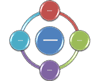
SmartArt
SmartArt is a graphic creator tool available in PowerPoint. It allows you to create visual representations of information. SmartArt can be a really helpful tool, use it intentionally and consider whether it is helpful for the purpose of the presentation.
To Learn more about SmartArt Graphics read this article from Microsoft. For instructional guidance about creating smart art access this informative Create a SmartArt graphic from scratch article.
When creating smart art ensure you use accessible colour combinations and colour contrast, add alternative text to the visual.
SmartArt can cause accessibility issues if the diagrams are not well integrated with screen readers or other assistive technologies, potentially making it difficult for users with visual impairments to access the information.
Additionally, if not properly labelled, the hierarchical and graphical nature of SmartArt might not convey the intended information effectively to all users.

Icons for understanding
Accessible icons are a designer’s best friend.
Without taking up much space, they help draw attention to important parts of a design where text may not work.
But to make sure they’re accessible, focus on using simple icons that are clearly visible.
Icons can be used to reinforce text. Placing icons and symbols next to text is a great way to make text easier to understand for people living with disabilities like dyslexia. Additionally, making use of ‘dual coding’ is a good practice for this purpose. Dual-Coding: Simple use of images to support working memory alongside text.
To learn how to Insert and edit an icon in PowerPoint access this article from Microsoft Support.
Visual Hierarchy: Accessible Structure
Here are some tips to ensure visual hierarchy:
- Use short simple sentences
- Make use of headings, subheadings. When doing so ensure to use ‘styles’. The Accessible Structure: Headings and Styles Article explains this further.
- Unique title for each slide. For slides with similar content using ‘continued…’ on the additional slide will make the two slides unique.
- Using bulleted lists
- Use icons and photos to reinforce concepts
- Minimize distractions with simple backgrounds
- Make your text large and avoid clutter
And here’s what you should avoid:
- Walls of text
- Bright contrasting colours
- Complex or cluttered layout
- Distracting backgrounds
- Small fonts
Table of Contents
A table of contents at the start of an accessible slideshow is very helpful. It shows what topics will be covered, so students can be prepared and know what to expect. This is like the saying, “Tell me what you’re going to tell me, tell me, and then tell me what you just told me.” It helps everyone follow along better. For neurodiverse students, like those with ADHD or autism, it gives a clear structure and makes it easier to focus and understand the material.
Providing an overview of the information, when breaks will happen, and what tasks are expected is also important. It helps students manage their time and reduces anxiety about what’s coming next. Knowing when they can take a break allows them to stay focused during the lesson, and understanding the tasks helps them be better prepared and more confident in their learning.
Key Principles Continued
This article is focused mainly on design principles but there are still other important things to consider while designing an accessible slideshow such as