Published on: 03/10/2023 · Last updated on: 02/01/2026
What is an accessible figure
All students must be able to engage with all content, including images, diagrams and charts. It’s important to consider accessibility for both sighted and non-sighted readers, including those with colourblind readers).
Accessible figures make it easier for all readers to access content and is also useful in preparing publication-ready figures: indeed many journals and disciplines will have their own best practices. For example M. White, How small changes to a paper can help to smooth the review process [2019].
Common Issues
- Relying only on colour to distinguish data (problematic for colourblind readers).
- Using poor colour maps (e.g., rainbow scales) that obscure interpretation.
- Presenting information only visually without alternatives.
Tips for Accessible Figures
- Use large, clear fonts.
- Use colours with textures, line styles, and shapes for clarity.
- Avoid red/green or blue/yellow contrasts.
- Check how figures look in greyscale.
- Ensure legends are legible.
- Beware of default settings in tools like Excel.
- Provide alternative formats (e.g. a text alternative to a flow chart or long description of a figure)
Put yourself in another’s shoes to consider the accessibility of a figure. What would the figure look like printed in greyscale (black and white)? Is the legend large enough to be legible?
Create accessible charts and plots in Excel
Many of the plots created with the default settings in Microsoft Excel will NOT be digitally accessible. The guidance below gives common tips to make bar/column, pie and line/scatter plots in Excel more accessible.
A default bar chart in Excel will have each series distinguished by a different block colour.
To supplement this colour information, we will use a different pattern for each data series:
- Right click on a data series you need to change and select “Format Data Series” from the menu.
- In the Format Data Series panel on the right, go to the “Fill and Line” settings and under Fill options, select Pattern fill.
- Select a pattern and repeat all steps until each series is uniquely patterned.
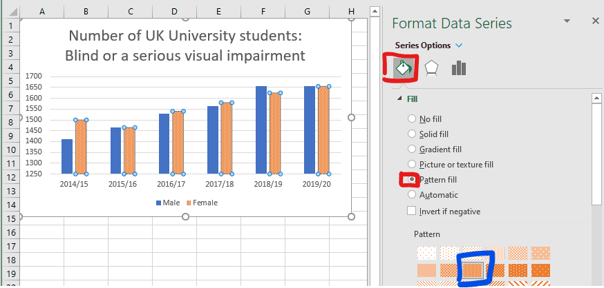
(Data source for this example was: HESA Table 15 – UK domiciled student enrolments by disability and sex 2014/15 to 2019/20)
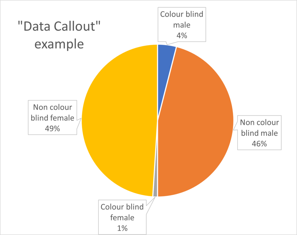
A default pie chart in Excel (pictured below) creates a colour-based legend only (in addition to having small text labels). To improve this we can Add data labels containing the series names (and values) to a pie chart.
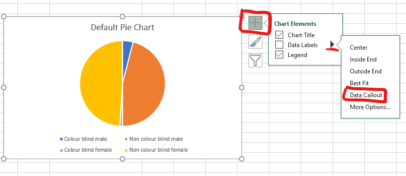
To improve the accessibility of this default pie chart:
- Click on the chart area then the “+” (chart elements) icon in the top right of the chart.
- Expand the data labels menu and select Data Callout (this labels the sections with their corresponding values).
- In the example: the Legends have been removed and the text size of the title and data labels has been increased.
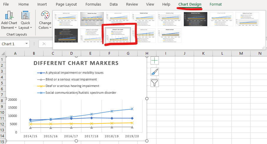
If you have more than one series, the default line or scatter plot in Excel will have these issues for colour contrast (pictured below):
- chart markers are all circles distinguished by colour only.
- lines are distinguished by colour only.

We can create different chart marker icons by selecting the chart then “Chart Design” (from the ribbon) and select an appropriate style with different chart markers (the example below, uses a line graph, but is the same procedure for a scatter plot).
At this stage, the information is now accessible to someone without colour vision, but we can continue to make improvements to the readability of the chart:

- Replace the legend with labels for each data series (this works well as the data series are well separated) and is also useful if a line chart has no data point chart markers.
- Change the line-style of each data series to be distinct (solid, dotted, dashed lines, dash-dot etc, which can be particularly useful if using a legend).
- Manually increased the line and marker weight to make each series appear more clearly.
- Change the line colour and marker colour of the yellow series to a darker colour (to improve contrast on white).
To save time in future, Save this chart as a template, to apply the many of the manual changes that have been made.
(Data source for this example was: HESA Table 15 – UK domiciled student enrolments by disability and sex 2014/15 to 2019/20)
Creating alternative text for STEM content
Alternative text (ALT-text) is a description of an image on a webpage or digital document. It is distinct from a caption (which serves to support a figure), as ALT-text conveys the context and content of an image to a blind reader (via a screen reader) who would otherwise not be able to access it.
How to include alt-text
Everywhere an image or figure appears it is important to include alt-text to make it accessible. See guidance on how to do this for Microsoft Office packages.
Key principles for supporting technical figures with alt-text
Alt-text is a simple way to provide information to a reader who can’t access it visually. The DIAGRAMcenter.org offer these key principles in writing effective alt-text:
- Context
- the description will depend on the context it is used in: is it decorative, an illustrative example or a central learning concept?
- Concise
- be succinct and avoid repeating information presented in the main text.
- Objective
- describe physical appearances and relationships
- don’t interpret or analyse, but allow readers to form their own opinions
- Move from generic to specific
- begin with high-level context
- expand to describe detailed information
Effective alt-text examples
The DIAGRAMcenter.org have a series of examples sorted by figure type: for example bar graphs, line graphs, relational diagrams with multiple start points/paths, etc.
- Image Description Guidelines and Examples (DIAGRAM Content Working Group)
- Poet Image Description Training Tool (DIAGRAM Center)
Going beyond alt-text
In some cases, descriptive alt-text does not do an adequate job of conveying what a figure is showing. For example, it is not meaningful to tabulate scatter data for a huge number of points showing a weak correlation: a better approach could be creating a tactile diagram of the scatter plot (supported by the Assistive Technology Department). Other case where alt-text may be insufficient by itself is where an interaction is needed, such as tasks needing visual responses or motor coordination that some users cannot access. In these cases, it is important to create a meaningful way for a student to access the content (rather than insert alt-text as a token effort), which could include working with the student and student support to find a solution.
Making sense of complex images gives a pragmatic guide to how to deal with alt-text for complex cases.
Using Desmos online graphing
Desmos is a free online tool that makes it easy to plot functions and data in 2D. Additionally, the formula and graphs are fully accessible to blind students via screen readers, braille readers, tactile diagrams and audio traces of functions (see Desmos accessibility). See this example graph is shown below and you can interact with it by clicking on the edit in Desmos icon.
Like most features of accessible design, Desmos graphs also enhance the functionality for all users. Other useful features include:
- scatter data (e.g. pasted from Excel) can be plotted
- sliders can allow variables to be adjusted
- users may pan or zoom to explore the graph